Wizard button placement

Hi, going off the latest Sketch PF4 file for the Wizard component eg here:
https://sketch.cloud/s/8Pamq/a/dm8agl

The ordering of the buttons seems contrary and opposite to every general UI pattern I’ve seen for button layout in wizards. Is this intentional, or is this some kind of L-to-R from R-to-L conversion mistake? Has this placement been tested?

2 Likes

Hi Mairin,
Thanks for posting this! I think it’s a great point and deserves further discussion. I have been curious about the same thing. I’ll follow up on this and keep this thread updated :slight_smile:

1 Like

The intention is to keep the button placement consistent for all use cases - forms, modals, wizards, etc. The primary button is the first / left-most button. In a wizard context it’s ‘next’.

Having the primary action button placed essentially in the middle of the screen is a bit weird though, you lose any Fitz’ Law benefit since it’s nowhere near an edge, and it also breaks the pattern of every other wizard users might encounter where the primary action button is in the lower right. The model for a wizard is a linear left-to-right path, like flipping through the pages of a book - you can’t flip forward by striking the page at the binding?

1 Like

Just noting that this forum has the reply button on the lower right corner of the card :slight_smile:

I agree with Mairin, the current order is weird and counterintuitive.

It should be like PF3.

1 Like

Thanks for providing feedback! It’s always welcome and appreciated. As noted above, this is a case where we are changing some of the patterns we had defined in PatternFly 3. After discussing with others on the team that contributed to this decision, I wrote a blog post to try to clarify the reasons behind this decision. Hopefully this alleviates the concerns expressed here, but please let us know if further clarification is needed.

The post is available at: http://bit.ly/button-placement

Hey Jenn,

I am curious to see if any other research was considered for this substantial of a decision? I was expecting to see comparisons or acknowledgements to Fitts’s Law, Jakob’s Law, or the Gutenberg Diagram, all three of which address how users parse information and associate the “end” of a page or window with the bottom right.

Can you go into further detail as to why we’re going against so many precedents, based on limited feedback? What problem are we trying to solve here that hasn’t already been solved? Let’s not try to reinvent how pages have evolved to read naturally.

Perhaps the largest offense is reversing the order of Next | Back | Cancel in the wizard component. Why is PatternFly digging in on the basis that the primary action must always come first, if it breaks how we comprehend progression (beginning : end :: left : right)?

By this reasoning, PatternFly breaks it’s own rule in being universal as the web browsers’ own navigation buttons appear as Back | Forward, not the other way around.

Hi Matthew,

I would argue that Fitt’s law supports our decision. The Primary action is now closer to the end of the form.

I would also argue that Jakob’s law should not be used to justify decisions that conflict with accessibility standards. If many sites don’t follow good accessibility practices, then according to Jakob’s law, users would prefer we never change to adopt accessibility standards? This logic does not align with inclusive design.

Design theory is great as a guide. But ultimately, research findings are best in justifying decisions. It should go without saying that doing research well is no easy task. For this decision, we are following the findings provided by Luke Wroblewski in his book Web Form Design.

There were similar comments in response to the blog regarding Next | Back buttons in pagination. Please refer to the blog for my response on that.

The primary action in accordance with Fitts’ law is best accessed via pointing device in one of the four corners of the screen (because the edges of the screen provide a backstop), 2nd best is on the edge of the screen.

When the primary action button is literally in the center of the screen because it’s in a wizard modal and placed first in L-to-R order with a lefthand sidenav occupying that space, it is in the most difficult space to target on screen.

Thanks for elaborating on that, Mairin. I totally did not see that interpretation originally, but I do see what you mean regarding positioning elements close to the edge.

I was primarily keying off of this phrase in the link referenced above when saying that it supports the position of having the buttons left-aligned with the form:
“Likewise, the distance between a user’s task/attention area and the task-related button should be kept as short as possible.”

In this statement, I consider the “user’s task/attention area” to be the form and not the edge of the screen. And therefore would argue that having the primary action immediately underneath the form and left-aligned with the form to be in practice with this law.

Fitts’ Law is from a paper from the 1940s or so regarding target acquisition with missiles. It’s been coopted by human factors / hci disciplines… basically the closer the target and the larger the target, the easier to hit. In the context of target acquisition on a computer screen you have factors you dont have flying a B-52 bomber trying to hit something below. Corners and edges are one thing. There’s other factors too. My masters thesis involved modifying Fitts to account for haptic feedback, which does have a positive effect on target acquisition.

Generally users do not focus on the dead center of screen. Eye tracking studies typically show Z and F pattern scanning, which means corners of the screen get the most attention when initially scanning the screen.

The application of the proximity piece of Fitts’ law to this design would mean the pointer/cursor would need to be likely to be in the center of the screen. Why would the user have the cursor in the center of the screen - what is your thinking there?

1 Like

Has there been any additional consideration to this?

Conventions for button placement have been well established, tested, and remain relevant to this day. Why, again, are we deciding to break away from them?

Jakob’s Law is relevant: If these conventions exist in other applications, would it not be worth considering how users interact with forms and wizards outside of a PatternFly design? Shouldn’t we be aiming for a consistent experience when designing interactions with these components?

FWIW I still care about this.

Hi team,

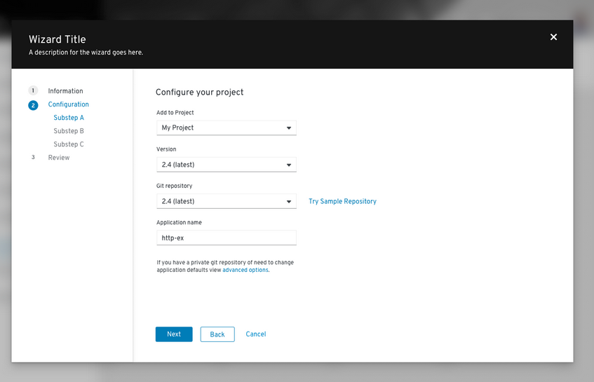
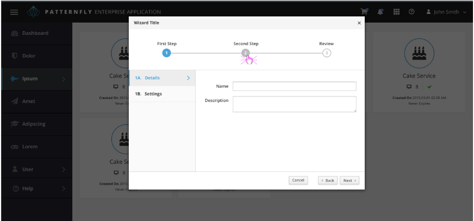
we came across this topic on our team as well, and I too challenge the decision about previous/next buttons in wizards. For 25+ years users have been trained “previous” is left, “next” is right in multi page / multi tab / wizard navigation…

It may not be true, but from the outside, and from reading this thread, as well as the referenced blog, it seems the conclusion was to decide for “principles” over “user experience”.

From the blog: “So, why is PatternFly challenging designers and developers to move away from a familiar standard?” --> my perspective is, Patterfly is challenging users more than anyone else with the reverse wizard navigation.

Did the team do any broader user studies or acceptance testing before making this decision (regarding wizard use case specifically)?

How agile is the community as far as user feedback is concerned - would you reverse the decision for wizards if UX acceptance testing would undermine?

  • Tobias

When implementing the new onboarding experience for CodeReady Containers we also used the Wizard and were amazed about this ordering as it is not suitable for a desktop implementation, like running React+Electron on Windows or macOS.

We asked for feedback from the community and stakeholders using a video: CRC Desktop application (WIP) - YouTube and it was the first feedback we got most often.

Looking at the Wizard guidelines this is intentional. But it breaks with the mental model that exists on the desktop.

Created an issue that is being discussed here: Button order for the Wizard is counter intuitive/not following established convention · Issue #1115 · patternfly/patternfly-design · GitHub