Read-only number input

I am trying to use Number input component [1] and works nicely in general.
The only issue I am having is that I don’t want users to change it manually, only by using those ± buttons.
For this reason I am not providing onChange property and the input part of this component has readonly attribute.
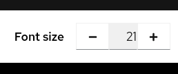
allrightexcepttextcursor

The first issue is that when I hover over this input, the cursor is text while I think it should be default:

.pf-c-form-control[readonly] {
     cursor: default;
 }

The other issue is that it is focusable and then looks a bit weird: <I can post only one picture /ME shakes fist> I’ll post it in comments.

I am not sure if the focus can be removed when it is readonly or not. Or if the rectangle can be made a bit less intrusive - for example not making the input to grow on focus in firefox and the value not moving up.
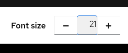
[1] https://www.patternfly.org/v4/components/number-input

Firefox:
withfocus

Chrome:
chromefocus

And on unrelated note, can this be removed? :slight_smile:
newusers

In the end, this is forum for Patternfly, so it is very likely that users wants to post pictures of things that don’t work for them.

Hey @marusak,

I think you’re looking to pass inputProps={{ disabled: true }}. You can play with this in codesandbox and add style or className tags with CSS if you think the cursor should be default rather than disabled.

As for the images and links I am also limited and not a fan. Sorry for the inconvenience.

  • Zack

the cursor is text while I think it should be default

Hey @marusak! I believe it’s more suitable as a text cursor since it’s technically regular text, like a paragraph (which is also read-only), and the text is selectable. This is also the default browser behavior for a readonly text input and how other systems like bootstrap handle it, so it’s a familiar style. However I’d like to ping @mcarrano and see if he has an opinion on this as well.

The other issue is that it is focusable and then looks a bit weird

Similar to the cursor styles, readonly text inputs are typically focusable, and this is the browser default behavior, so I think it’s appropriate to leave it, though there should be padding on the left/right that would keep the text from touching the edge of the text input.

I have a demo here - are you seeing the text touch the edge of the input here as well? https://codesandbox.io/s/brave-brattain-ser8j?file=/index.js

If so can you tell me what OS and specific browser version you’re using?

I think you’re looking to pass inputProps={{ disabled: true }}

From the sound of the original issue, I believe they’re looking for inputProps={{ readOnly: true }}

I agree with @mcoker about the cursor. Yes, I can see where it feels odd to have a text cursor for a non-editable field. But this is standard browser behavior and consistent with other read-only fields in PatternFly.

This is quite helpful thanks.