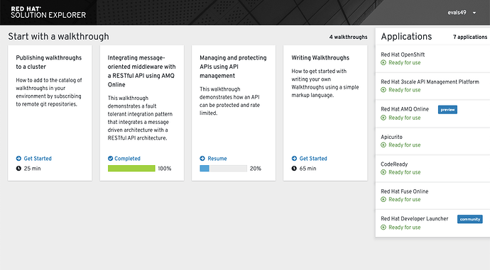
Since the Integreatly web app is more content focused than traditional RH products, we are noticing a lack of color and visual interest on our dashboard and within the screens. We were wondering if you have any recommendations on color usage in the masthead and for other backgrounds (such as the about modal). For example, is there a blue instead of the default dark gray that we could use instead? Is it ok to use an alternate overlay color and do you have recommendations on what values to use?
I would recommend you stay with the black overlay until we have further branding elements to accent the UI in the future.
