
Hallo.
I have this design from @nlcwong:
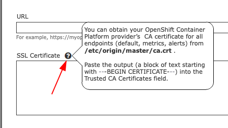
There’s an icon with help text in the field label.
I do not know how to do that with the components that are available in patternfly/react-core
I tried this:
By putting the Popover around an Icon in the label, I get the icon displayed.
Then by placing the popover in a div and calling preventDefault I get the popover working well, partly, it’s not properly styled.
My question: Is this the proper way forward with the pattern? Or shall it be/will it be supported in some simpler way?
(code below is live in the codesandbox link above)
<Form>
        <FormGroup
          label={
            <React.Fragment>
              Here shall be an icon with a Popover !
              <span onClick={e => e.preventDefault()}>
                <Popover
                  bodyContent={
                    <div>
                      Lorem ipsum dolor sit amet, consectetur adipiscing elit.
                      Nullam id feugiat augue, nec fringilla turpis.
                    </div>
                  }
                >
                  <CogIcon />
                </Popover>
              </span>
            </React.Fragment>
          }
          isRequired
          fieldId="simple-form-name"
          helperText="Please provide your full name"
        >
          <TextInput
            isRequired
            type="text"
            id="simple-form-name"
            name="simple-form-name"
            aria-describedby="simple-form-name-helper"
            value="Funny name"
          />
        </FormGroup>
...