Donut chart data slice larger radius

I’ve been trying to figure our through the data property how to make the “red” only slice of data appear thicker (larger radius) vs. the others - I’ve not found anything in docs on that - any help would be appreciated.

image

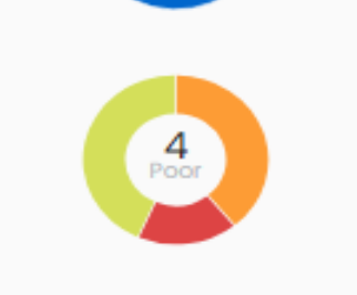
data={[{ x: 'Good', y: 9 }, { x: 'Poor', y: 4, size: 15 }, { x: 'Excellent', y: 10 }]}

@dlabrecq any advice on this?

You can override the radius, but not via the data property. The innerRadius prop could be used to make the radius appear thicker, but it’s for the entire donut – not just for the red portion.

You might try overlaying another chart on top with a slightly different inner radius. That’s what we do with the donut utilization threshold component.

http://patternfly-react.surge.sh/charts/donut-utilization-chart#static-thresholds