Hey DanyG! Yeah we did it with the @material-ui components. So easy. Create a component with the code they have it on the web. Later yo need to import on your Layout or other principal component like AppLayout or something like this. And that’s all. hahahahaha…if you need to pass some props for the drawer or need some “action” with the drawer, edit the code of the drawer, and when you call it render all.
The Code of my DRAWER:
> import React from 'react';
> import { makeStyles } from '@material-ui/core/styles';
> import Drawer from '@material-ui/core/Drawer';
> import Button from '@material-ui/core/Button';
> import List from '@material-ui/core/List';
> import Divider from '@material-ui/core/Divider';
> import ListItem from '@material-ui/core/ListItem';
> import ListItemIcon from '@material-ui/core/ListItemIcon';
> import ListItemText from '@material-ui/core/ListItemText';
> import InboxIcon from '@material-ui/icons/MoveToInbox';
> import MailIcon from '@material-ui/icons/Mail';
> import  ToolbarNotificationBadge  from '@app/Dashboard/NotificationBadge';
>
> const useStyles = makeStyles({
>   list: {
>     marginTop: '2rem',
>     width: 250,
>   }
>
> });
>
> export default function TemporaryDrawer() {
>   const classes = useStyles();
>   const [state, setState] = React.useState({
>     right: false,
>   });
>
>   type DrawerSide =  'right';
>   const toggleDrawer = (side: DrawerSide, open: boolean) => (
>     event: React.KeyboardEvent | React.MouseEvent,
>   ) => {
>     if (
>       event.type === 'keydown' &&
>       ((event as React.KeyboardEvent).key === 'Tab' ||
>         (event as React.KeyboardEvent).key === 'Shift')
>     ) {
>       return;
>     }
>
>     setState({ ...state, [side]: open });
>   };
>
>   const sideList = (side: DrawerSide) => (
>     <div
>       className={classes.list}
>       role="presentation"
>       onClick={toggleDrawer(side, false)}
>       onKeyDown={toggleDrawer(side, false)}
>     >
>       <List>
>         {['Inbox', 'Starred', 'Send email', 'Drafts'].map((text, index) => (
>           <ListItem button key={text}>
>             <ListItemIcon>{index % 1 === 0 ? <InboxIcon /> : <MailIcon />}</ListItemIcon>
>             <ListItemText primary={text} />
>           </ListItem>
>         ))}
>       </List>
>       <Divider />
>       <List>
>         {['All mail', 'Trash', 'Spam'].map((text, index) => (
>           <ListItem button key={text}>
>             <ListItemIcon>{index % 2 === 0 ? <InboxIcon /> : <MailIcon />}</ListItemIcon>
>             <ListItemText primary={text} />
>           </ListItem>
>         ))}
>       </List>
>       <Divider />
>       <List>
>         {['All mail', 'Trash', 'Spam'].map((text, index) => (
>           <ListItem button key={text}>
>             <ListItemIcon>{index % 3 === 0 ? <InboxIcon /> : <MailIcon />}</ListItemIcon>
>             <ListItemText primary={text} />
>           </ListItem>
>         ))}
>       </List>
>     </div>
>   );
>
>
>
>   return (
>     <div>
>       <div onClick={toggleDrawer('right', true)}><ToolbarNotificationBadge aria-label="Notifications actions" /></div>
>       <Drawer anchor="right" open={state.right} onClose={toggleDrawer('right', false)}>
>         {sideList('right')}
>       </Drawer>
>     </div>
>   );
> }
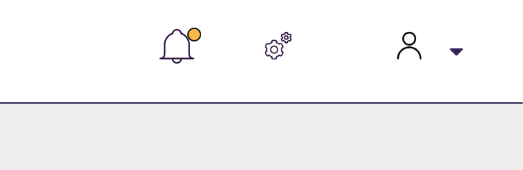
If you look it, you can see, inside the render, the “ToolbarNotificationBadge”, this is 'cause we need to change the icon to “reader” when the user click on the advise of the drawer.
With this code and this (below) on the layout you can see the Drawer working fine on your app.
const PageToolbar = (
    <Toolbar>
      <ToolbarGroup className={css(accessibleStyles.screenReader, accessibleStyles.visibleOnLg)}>
          <ToolbarItem>
          <Drawer />
        </ToolbarItem>
</ToolbarGroup>
</Toolbar>
);
This “const” it’s inside the render of the “PageToolbar” group of PF 4 Layout Design, oc course.
Maybe this can help you.
Regards!!