
Currently in our dashboard, we have multiple sections of cards and a count above each section that uses the default/read badge treatment. This gray is the same used for the BG color behind the cards, so the badge pill treatment isn’t visible in this situation. After talking with Adam about automatic “theming” of colors, could that be utilized here to change the badge from gray to a different color in order to see the pill? Here’s how it looks now:
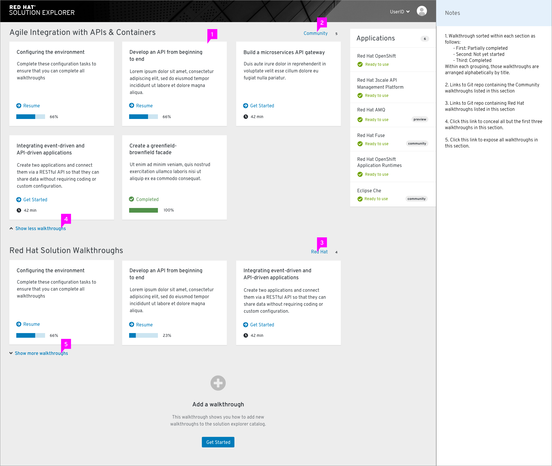
Any suggestions on how we can remedy this? Was thinking the pill could be white or a darker gray in this situation, but would depend on what is still accessible from a contrast standpoint.
 In this case going from a light gray to white doesn’t seem like a change drastic enough to introduce confusion or inconsistency. I think the badge component is unique enough to handle that and still be easily recognizable as the badge.