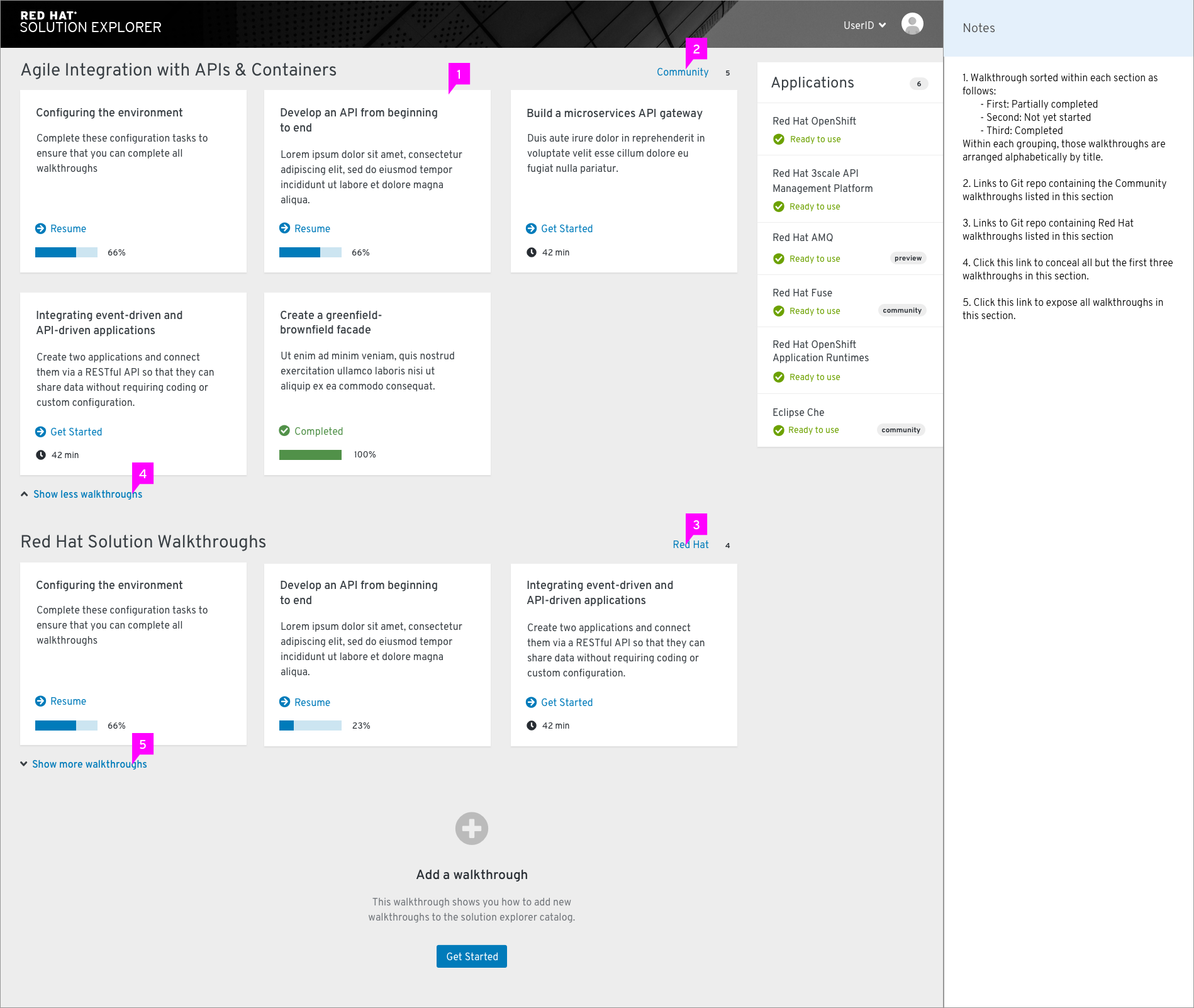
We’re using the expandable component on our dashboard, where we end up with it on the default gray bg. The contrast between the link blue and bg is 3.95, The font is 16pt semibold according to live examples I’ve inspected. Looking at the WC3 site, they have the following scenario as a “Sufficient Technique” for AA contrast minimums https://www.w3.org/WAI/WCAG21/quickref/?showtechniques=143#contrast-minimum:
Situation B: text is at least 18 point if not bold and at least 14 point if bold
• G145: Ensuring that a contrast ratio of at least 3:1 exists between text (and images of text) and background behind the text…
Do we know if semibold passes as bold for accessibility? We have another link next to our badges that needs to pass as well. Thought I’d just replicate the treatment of the expandable component link, but wanted to verify the current expandable component is working alright in our situation from the contrast standpoint.